Why Most Living Rooms Feel “Off” — And How Color Fixes It
Living room color ideas — those three words completely changed how my home felt. Not joking.
Two years ago I moved into a new apartment. The walls were this standard builder-grade beige — the kind of color that’s technically inoffensive but also completely soul-crushing. My sofa was nice. My furniture was decent. But every time I walked in, the room just felt… flat. Like a waiting room at a dentist’s office.
I spent months rearranging furniture, adding throw pillows, buying plants. Nothing worked. A friend finally came over and said, “Your walls are killing the vibe.” And she was right.
That started a months-long obsession with color theory, paint samples, interior design YouTube rabbit holes, and two trips to IKEA I did not plan for. I also painted one wall an extremely confident shade of terracotta before realizing I had zero idea what I was doing.
The result? I now have a living room I genuinely love walking into every single day. And I have a lot of opinions about what works, what doesn’t, and what color trends in 2026 are actually worth your time — not just Instagram bait.
This article breaks down the best living room color ideas for 2026, from timeless classics to new trending palettes, with real image so you can visualize each one before you commit. Let’s get into it.
| 💡 Quick Tip Before You Start Always test paint in your actual room under natural AND artificial light before committing. A color that looks perfect at the store can look completely different at home. Tools like the Benjamin Moore Color Portfolio app and Sherwin-Williams ColorSnap Visualizer let you “try” colors digitally first. |
The 2026 Color Trends You Need to Know
Before we get into specific ideas, here’s the big picture: 2026 is moving hard away from the cold, grey minimalism that dominated the 2010s. We’re seeing a return to warmth, texture, and personality.
The Pantone Color of the Year 2026 direction is pointing toward earthy, grounded tones with emotional resonance — think warm clays, deep forest greens, aged terracottas, and creamy whites that feel lived-in rather than sterile.
The three biggest macro trends shaping living room color ideas right now:
- Warm Minimalism: Less color, but richer and more intentional — cream, stone, warm white with a single earthy accent
- Dark Drama: Navy, forest green, charcoal — moody rooms that feel cozy rather than cold
- Japandi Earthiness: The Japanese-Scandinavian hybrid trend is still going strong with sage greens, warm grays, and natural wood tones
Now, let’s break these down into actual, actionable ideas you can use.
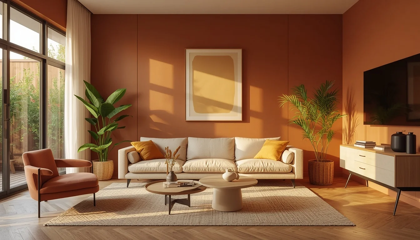
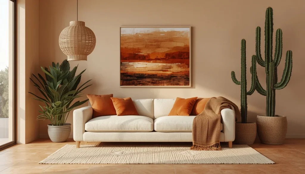
Idea #1 — Warm Terracotta & Cream: The Combo That Saved My Living Room
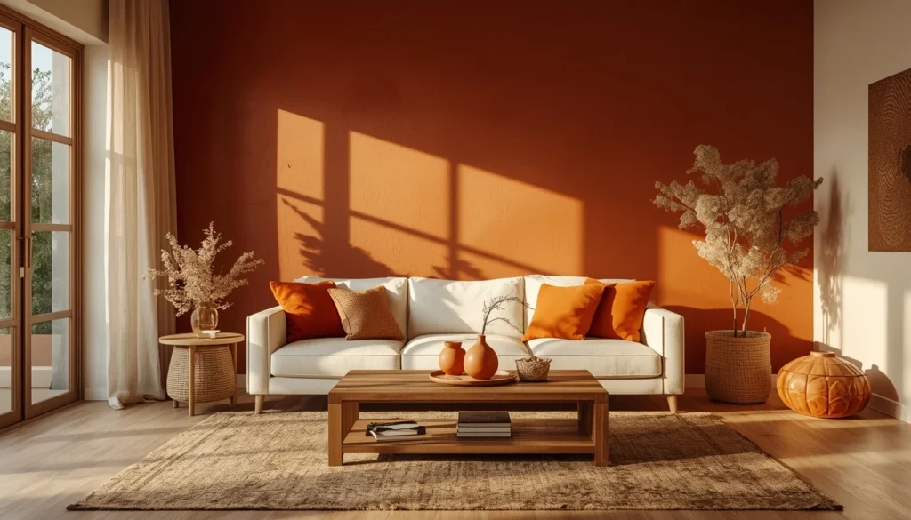
This is the combination that fixed my apartment. Terracotta on a single accent wall — not all four walls — paired with cream furniture and warm wood accents.
The mistake most people make is going too orange. Real terracotta is more of a dusty, muted clay tone. Think Adobe, Sienna, or the color of old Mediterranean roof tiles. I used Sherwin-Williams “Cavern Clay” (SW 7701) and it was absolutely perfect.
Why it works: terracotta is warm without being aggressive. It reads differently morning to evening — almost rusty gold in afternoon sunlight and a deeper brick tone at night. Pair it with cream walls on the other three sides and you get depth without overwhelm.
- Best for: south or west-facing rooms with natural light
- Accent colors: brass fixtures, cream textiles, natural wood
- Avoid: cool-toned metals, stark white, purple-based pinks
Real experience: I almost painted all four walls. My designer friend talked me out of it over a phone call. One accent wall is almost always the right move, especially in a smaller space.
Idea #2 — Midnight Navy with Gold Accents: Dark, Luxurious, and Surprisingly Cozy
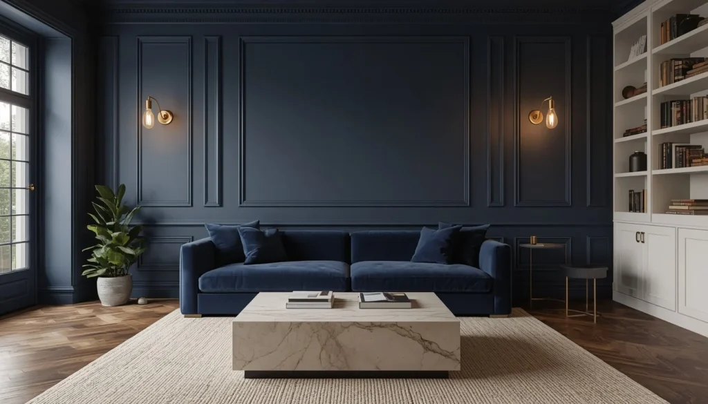
Dark rooms have a bad reputation they don’t deserve. When done right, a navy living room is one of the most sophisticated and actually cozy spaces you can create.
The trick is lighting and contrast. You need: (1) enough warm light sources — think multiple lamps, not just overhead lighting — and (2) enough contrast with lighter furniture and accents so the room doesn’t feel like a cave.
My friend did her entire living room in Benjamin Moore “Hale Navy” (HC-154). I was skeptical. Then I walked in and immediately wished I’d done the same. It felt like a boutique hotel, but cozy. The secret was her brass floor lamp, cream bouclé sofa, and gallery wall with white frames.
- Best for: north or east-facing rooms, or those with limited natural light (counterintuitive, I know — but the darkness becomes a feature)
- Accent colors: gold, brass, cream, warm white, blush
- Avoid: cool grays, chrome, black furniture
Idea #3 — Japandi Sage & Warm White: The Trend That Won’t Quit
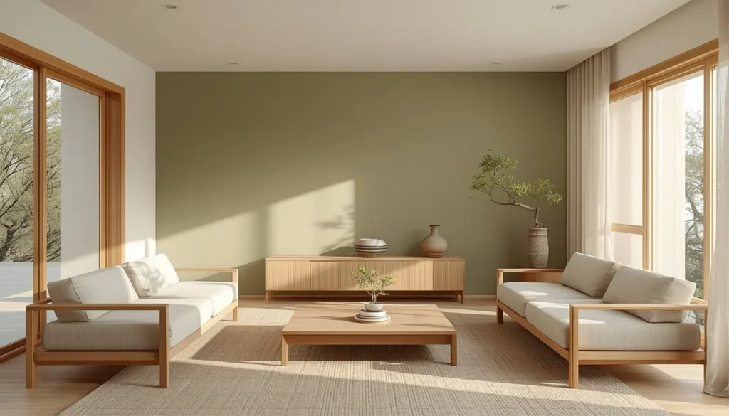
If there’s one style that has genuinely earned its popularity, it’s Japandi. The Japanese-Scandinavian design fusion is built on restraint, natural materials, and a very specific relationship with color — which is to say: not much of it, but chosen very carefully.
Sage green is the hero color here. It’s not a bright green, not a dark green — it’s a dusty, slightly grayed green that reads as almost neutral while still adding life to a room. Combined with warm white walls, light oak or ash wood furniture, and linen textiles, it creates a space that genuinely feels calming in a way that’s almost hard to explain until you’re in it.
The paint brands doing this best right now: Farrow & Ball “Mizzle” (No. 266) and Little Greene “Sage.” Both are on the pricier side but worth it for the quality and depth of color.
- Best for: any room, especially those with natural light and wood floors
- Accent materials: linen, rattan, light oak, stone, ceramic
- Avoid: heavy ornate furniture, cool-toned accessories, anything shiny or metallic
Idea #4 — Moody Dark Academia Greens: For People Who Want Drama Without Going Full Black
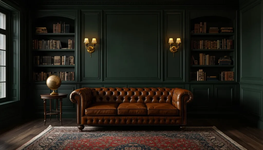
The dark academia aesthetic moved from dorm rooms and TikTok into actual interior design — and honestly it works so much better in a real living space than I expected.
Think deep forest green, hunter green, or bottle green walls paired with leather, dark wood, and warm brass. It evokes old libraries, literary salons, and spaces that feel like they have a story.
The key to making this work is layering textures. A flat dark green wall alone is intense. But dark green walls + leather sofa + Persian rug + warm bookshelves creates something that feels rich and intentional rather than oppressive.
Paint to try: Dulux “Rainforest Walk,” Benjamin Moore “Hunter Green” (2041-10), or Farrow & Ball “Calke Green” (No. 80).
- Best for: rooms with high ceilings, or spaces used primarily in the evening
- Accent colors: cognac, amber, dark wood, antique brass, burgundy
- Avoid: anything too modern or industrial — this palette needs warmth to breathe
Idea #5 — Dusty Rose & Warm Gray: The Underrated Pairing
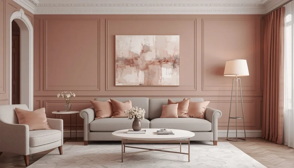
This one surprises people. Pink in a living room? But dusty rose — not baby pink, not hot pink, but a muted, grayed-down rose — is one of the most sophisticated and versatile color choices you can make.
It works because it’s essentially a warm neutral. Dusty rose reads very differently depending on what you pair it with. With warm gray furniture, it feels modern and restrained. With cream and gold, it feels more French-inspired and romantic. With natural linen and wood, it edges into Scandi territory.
I’ve seen this done in a small apartment studio and in a large farmhouse living room, and it works beautifully in both. The key is going soft and muted — if the pink has any brightness to it, you’ve gone too far.
- Try: Sherwin-Williams “Mellow Coral” (SW 6342) or Benjamin Moore “Pale Blush” (2174-70)
- Best for: spaces you use for relaxing, reading, or entertaining
- Accent colors: warm gray, cream, gold, sage, ivory
Idea #6 — Bold Two-Tone Walls: The 2026 Trend Making Rooms Look Bigger
This is the 2026 trend I’m most excited about and the one that most people are sleeping on. Two-tone walls — painting the lower and upper halves of a wall in two different colors, usually separated by a chair rail or painted dividing line — are having a massive moment.
Done well, this technique adds architectural interest to even the most basic box room. It makes walls look taller, adds depth, and gives you the ability to incorporate a bolder color without it overwhelming the space.
The classic combo: warm white on top, muted darker color on the bottom. But 2026 is seeing more unexpected pairings — sage over cream, charcoal over stone, navy over sand.
The dividing line is usually around 1/3 to halfway up the wall. A simple painted stripe works, but adding actual wood chair-rail molding elevates the whole look significantly.
- Best for: rooms with high ceilings, period homes, or anyone wanting to add character without a full renovation
- Top combos: warm white + terracotta, cream + sage, light gray + navy
- Avoid: contrasts that are too stark without a natural material (like wood trim) to bridge them
Idea #7 — Classic White Done Right: Not All Whites Are Created Equal
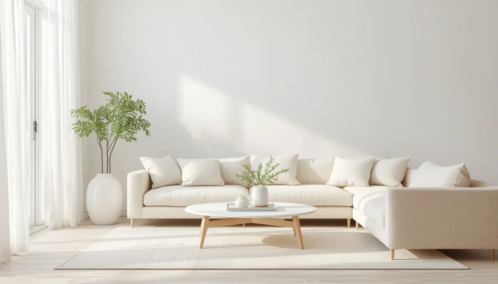
I need to talk about white because it’s where most people go wrong. Not all white is the same, and choosing the wrong white is one of the most common decorating mistakes I see.
There are broadly three kinds of white: cool whites (with blue or gray undertones), neutral whites, and warm whites (with yellow, pink, or cream undertones). Stark cool white works in very specific spaces — modern architecture, lots of natural light, paired with warm wood to offset the chill. In most living rooms, it just looks harsh and clinical.
Warm whites are the secret weapon. They read as “white” to most people but feel completely different in a space. Benjamin Moore “White Dove” (OC-17) is probably the most-recommended warm white in interior design circles for a reason — it works in almost every lighting condition.
Other greats: Farrow & Ball “Pointing” (No. 2003), Sherwin-Williams “Alabaster” (SW 7008), and Dulux “Natural Calico.”
- Pro tip: If you’re unsure, go warm white. It photographs beautifully, sells houses, and makes furniture look better.
- Pair with: natural wood, linen, bouclé, warm metals, plants
- Avoid: pairing with cool-toned gray furniture — the combination looks unintentional
Idea #8 — Desert Sand & Rust: The Warm Palette That’s Everywhere in 2026
The desert color palette has gone mainstream and for good reason — it’s one of the most naturally harmonious color systems that exists. Sandy beige base tones with accents of rust, ochre, burnt orange, and warm brown create a space that feels grounded and instinctively comfortable.
This palette works especially well in homes with natural materials — concrete floors, terracotta tiles, exposed brick, or wooden beams. It also layers brilliantly with plants: desert plants like cacti and snake plants, but also any green-leafed plant adds a perfect natural contrast to the warm base tones.
The palette is versatile enough to feel either bohemian or modern depending on how you execute it. Clean lines and simple furniture = modern desert. Layered textiles and organic shapes = boho.
- Base colors: sand, warm taupe, creamy beige
- Accent colors: rust, burnt orange, ochre, terracotta, warm brown
- Best materials: rattan, jute, ceramic, linen, natural wood
Idea #9 — Ocean-Inspired Blues & Whites: Fresh Without Being Nautical
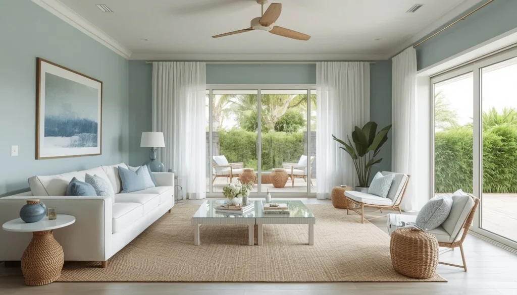
Let me be clear about something: there’s a difference between coastal-inspired blues and nautical cliche. I’m not talking about anchor prints and rope everywhere. I’m talking about the kind of sophisticated blue palette that evokes the ocean without screaming beach house.
The colors that achieve this: soft aqua, washed denim blue, sea glass teal, and dusty cerulean. Paired with white, sand, and natural textures (sea grass rugs, linen curtains, driftwood accents), these create spaces that feel open, airy, and endlessly calm.
What keeps this from becoming a cliche is restraint. No fish paintings. No novelty nautical accessories. Just the color and the texture and the light.
- Best blues: Benjamin Moore “Blue Echo” (2123-40), Sherwin-Williams “Sea Salt” (SW 6204)
- Accent tones: warm white, sand, natural wood, stone
- Best for: rooms with views, bright spaces, or wherever you want to create a feeling of calm
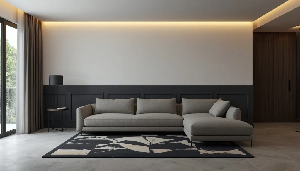
Idea #10 — Warm Black & Warm Beige: High Contrast for the Brave
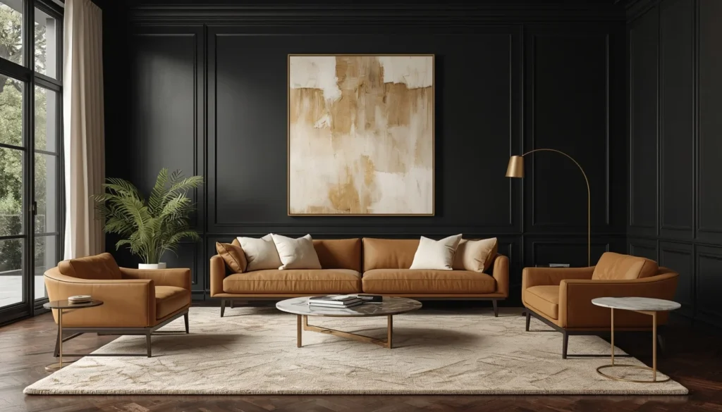
This is for the bold. Warm black walls — think off-black, charcoal-black, the kind of black that has a slight warmth to it rather than a cold blue-black — paired with warm beige and camel furniture create one of the most striking interiors possible.
The key word is warm. A cool, blue-toned black is harsh and unforgiving. A warm off-black (try Farrow & Ball “Railings” No. 31 or Benjamin Moore “Black Panther” 2125-10) has enough warmth to feel dramatic rather than oppressive.
This palette requires confidence and commitment. But done right, it’s genuinely stunning — and photographs unbelievably well.
- Best for: living rooms with high ceilings, good natural or artificial lighting, bold furniture
- Accent colors: camel, warm white, gold, cognac, cream
- Not recommended for: small rooms with low ceilings or very limited light sources
Color Comparison Table: Which Living Room Color Palette Is Right for You?
Here’s the quick breakdown to help you choose. This is genuinely useful — I wish I’d had this before my terracotta experiment.
| Color Palette | Best Room Size | Light Requirement | Mood | Skill Level | Cost to Execute | 2026 Trend Score |
| Terracotta & Cream | Small–Large | Any light | Warm & Earthy | Beginner | Low–Medium | ⭐⭐⭐⭐⭐ |
| Midnight Navy & Gold | Medium–Large | Any (moody) | Luxurious | Intermediate | Medium–High | ⭐⭐⭐⭐ |
| Japandi Sage & White | Any | Best with natural | Calm & Serene | Beginner | Medium | ⭐⭐⭐⭐⭐ |
| Dark Academia Green | Large | Evening-friendly | Dramatic & Rich | Intermediate | Medium | ⭐⭐⭐⭐ |
| Dusty Rose & Gray | Small–Medium | Any light | Elegant & Soft | Beginner | Low–Medium | ⭐⭐⭐⭐ |
| Two-Tone Walls | Any | Best high-ceiling | Architectural | Intermediate | Low–Medium | ⭐⭐⭐⭐⭐ |
| Warm White | Any | Best natural | Fresh & Clean | Beginner | Low | ⭐⭐⭐⭐ |
| Desert Sand & Rust | Any | Any light | Boho & Grounded | Beginner | Low–Medium | ⭐⭐⭐⭐⭐ |
| Ocean Blues & White | Small–Large | Best bright | Breezy & Calm | Beginner | Low–Medium | ⭐⭐⭐⭐ |
| Warm Black & Beige | Large | Well-lit needed | Bold & Dramatic | Advanced | Medium | ⭐⭐⭐⭐ |
Tools & Apps to Test Colors Before You Paint
Committing to a wall color based on a 2-inch paint chip under fluorescent store lighting is a recipe for regret. These are the tools that actually help:
1. Benjamin Moore Color Portfolio App
One of the best AR color visualization tools available. Point your phone at your wall and see how any of their colors would look in your actual room. Not perfect — screens can’t fully replicate paint — but dramatically better than guessing.
2. Sherwin-Williams ColorSnap Visualizer
Similar concept, and it also lets you upload a photo of your room rather than needing to be in it. This is incredibly useful for planning rooms in different seasons or lighting conditions.
3. Pinterest & Houzz
Not apps, but visual research gold. Search the exact palette you’re considering and see hundreds of real rooms. Filter by room size, style, and budget. I spent about three evenings on Houzz before my living room makeover.
4. Canva Color Palette Generator
Upload a photo of a room you love and Canva will extract the exact color palette. Then you can match those hex codes to paint brands using a tool like ColorNameFinder.
5. Real Paint Samples
Counterintuitive, but: digital tools are for shortlisting, not final decisions. Always order actual paint samples (most brands sell sample-size cans cheaply) and paint a 30x30cm patch on your wall. Live with it for 48 hours across different lighting conditions before committing.
Mistakes I Made (So You Don’t Have To)
| ⚠️ Real Talk Section This is the part where I get honest about what went wrong in my own color journey. Learn from my pain. |
- Painting all four walls dark. I once painted a small bedroom all four walls navy thinking it would be cozy. It was claustrophobic. One or two walls, maximum.
- Ignoring undertones. I bought what looked like a warm gray. Turned out it had strong purple undertones that only revealed themselves under my living room’s LED lighting. Always check undertones under YOUR specific light.
- Forgetting the ceiling. Most designers recommend painting the ceiling slightly lighter than the walls — even in a white ceiling room. Matching your ceiling exactly to your walls in a dark room makes it feel lower. Going one shade lighter creates a subtle lift.
- Not accounting for furniture. I had sage green walls picked out before I realized my sofa was a warm taupe that clashed with the cool green undertones. The order: choose your largest furniture piece first, then pick your wall color to complement it.
- Buying cheap paint. Not all paint is equal. Cheap paint often requires 3-4 coats, doesn’t cover well, and the color can shift as it dries. Good paint (Benjamin Moore, Farrow & Ball, Sherwin-Williams) covers in 2 coats and stays true.
- Rushing the decision. That wall I painted terracotta before I was ready? I chose the color in a 10-minute store visit after seeing it online. Take at least 2 weeks from “I like this color” to “I’m buying paint.”
Step-by-Step: How to Pick Your Living Room Color in 2026
Here’s the actual process I now follow — and recommend to anyone who asks:
- Assess your room: note the size, ceiling height, number of windows, and which direction they face. South-facing rooms get warm afternoon light. North-facing rooms get cooler, more diffuse light. This affects how colors read.
- Identify your existing anchors: what furniture, flooring, or fixed elements (like a brick fireplace or wood beams) are you keeping? These set your starting palette. Note whether their undertones are warm or cool.
- Pick a mood: calm and serene? Dramatic and bold? Warm and cozy? Airy and bright? This filters your color direction before you even look at paint chips.
- Research visually: use Pinterest, Houzz, or Instagram to find 10-15 rooms that match your mood. What colors keep appearing? That’s your direction.
- Shortlist 3-5 colors: visit a paint store or order sample cards. Focus on different lighting — hold them up near a window AND in the darkest corner of the room.
- Order sample pots: paint A4-size or larger patches on different walls. Leave them for 48 hours. Look at them in morning light, afternoon light, and evening artificial light.
- Commit and execute: once you’ve chosen, buy enough paint (calculate coverage carefully), use quality primer especially if going from light to dark, and use painter’s tape for clean edges.
- Live with it for 2-4 weeks before making any major decor changes. Colors take time to “settle” psychologically — what felt surprising on day one often feels completely natural by week two.
FAQs: Questions Real People Ask
What is the most popular living room color in 2026?
The most popular living room color ideas in 2026 center around warm earthy tones — particularly terracotta, warm white, sage green, and dusty neutral palettes. The shift is away from cold grays and toward warmer, more grounded colors influenced by Japandi design and biophilic interior trends.
What colors make a small living room look bigger?
Light, warm neutrals make small living rooms feel larger. The best choices include warm white (like Sherwin-Williams Alabaster), soft sage green, and light sand tones. Avoid dark colors on all four walls in small spaces — if you want depth, use a dark accent on a single wall only.
What is the best living room color for resale value?
Neutral warm tones consistently outperform bold colors when selling a home. Warm white, greige (gray-beige), and light sage are the safest choices. Studies from real estate sources suggest neutral rooms sell faster and for higher prices than rooms with bold or polarizing colors.
How do I choose a living room color that goes with brown furniture?
Brown furniture pairs beautifully with warm earthy colors. Best options include terracotta, sage green, warm white, sand, and dusty rose. Avoid cool-toned colors like cool gray or icy blue — they clash with the warm undertones in brown wood furniture.
What colors are trending for living rooms in 2026?
The top living room color trends in 2026 include: warm terracotta, Japandi sage green, dusty rose, moody dark greens, warm off-whites, desert sand palettes, two-tone wall combinations, and bold warm blacks paired with camel or beige.
Should I use the same color throughout an open-plan living space?
Not necessarily. In open-plan spaces, using different tones of the same color family creates flow without monotony. For example: warm white on kitchen walls, sage green in the living area, and a medium warm tone in a dining zone. The key is choosing colors from the same undertone family so they harmonize when seen together.
Final Thoughts: The Right Color Changes Everything
The best living room color ideas aren’t the ones on Pinterest or in design magazines — they’re the ones that work in your specific room, with your specific light, and make you genuinely happy to come home.
My terracotta-and-cream living room is not particularly trendy or editorial. It doesn’t photograph perfectly. But it feels like home in a way that my generic beige walls never did, and that’s exactly the point.
The tools are there to help you visualize. The samples are there to help you decide. The step-by-step is there to keep you from making the same mistakes I did. But at the end of the day, trust your gut — because you’re the one who has to live in it.
If you’re still stuck, start with terracotta. I’m biased, but it’s because it worked so well I still can’t believe I nearly went with beige.
You May Also Like These Posts
→ Budget Kitchen Makeover 2026
→ 4th of July Front Porch Decor Ideas
→ Summer Home Décor Ideas 2026