
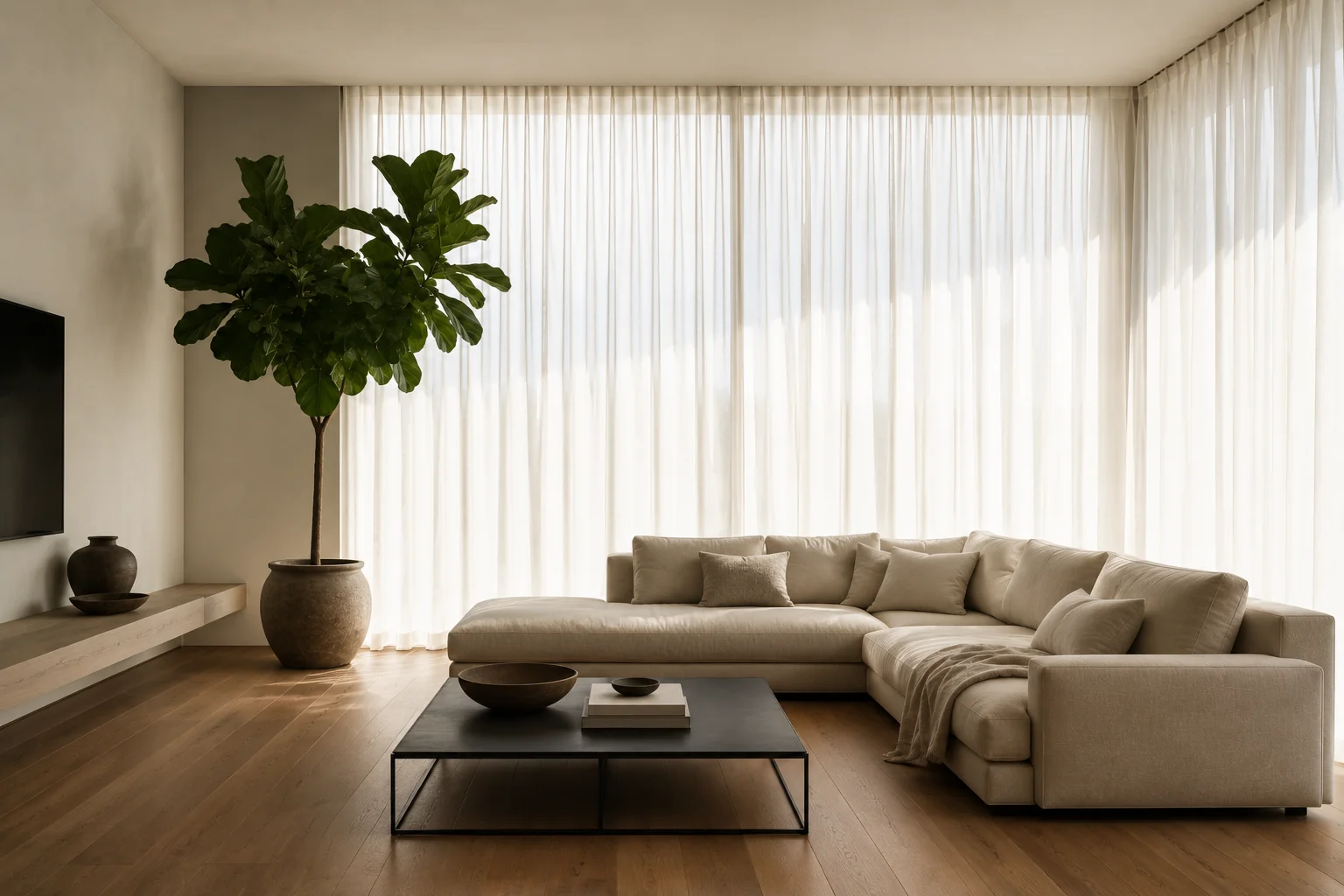
Okay, real talk. Two years ago, my living room looked like IKEA and a weekend flea market had a baby. Shelves overloaded with random decor, a sofa I didn’t like but kept ‘just because’, three side tables that served no purpose, and a TV unit so massive it practically had its own zip code.
I wasn’t living in my space. I was navigating through it.
Then I came across the phrase minimalist living room 2026 during a late-night Pinterest spiral, and something clicked. I spent the next six months actually doing it — not just pinning ideas, but ripping furniture out, repainting walls, returning impulse buys, and learning the hard way what actually works.
This article is everything I wish I’d known before I started. It’s 15 real ideas, not the same recycled advice you find everywhere. Each one has a distinct approach, a trend angle, and an image.
Let’s get into it.
WHAT MAKES 2026 DIFFERENT?
What Makes a Minimalist Living Room in 2026 Actually Different?
Minimalism isn’t new. But the 2026 version isn’t about white walls and emptiness. It’s warmer, smarter, and a lot more liveable than the cold, sterile aesthetic that dominated the 2010s.
Here’s what’s shifted:
- Warm neutrals (beige, terracotta, warm white) have replaced cold gray and stark white
- Tech is hidden — no ugly cables, no giant black screens dominating the room
- Natural textures — linen, jute, raw wood — are doing the heavy lifting on ‘design’
- Japandi (Japanese + Scandinavian fusion) has fully gone mainstream
- Empty space is intentional, not accidental — it’s considered a design element
- Sustainability plays a big role — buying less but buying better
The minimalist living room 2026 movement is about editing your space down to only what genuinely adds comfort or beauty — and then stopping there. No more ‘but what if I need it someday’ energy.
15 MINIMALIST LIVING ROOM 2026 IDEAS
Idea #1: Japandi Fusion with Warm Neutrals
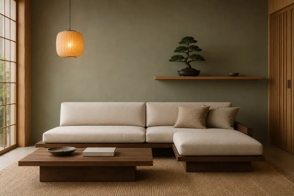
Japandi is still the most searched interior style in 2026, and honestly, it earns that spot. The concept is simple: take Japanese minimalism (functional, quiet, purposeful) and blend it with Scandinavian warmth (natural materials, cozy textures, soft lighting).
What I did in my own space: I sold my chunky Western sofa and replaced it with a low-profile frame in walnut with simple linen cushions. No armrests, no fuss. The sofa went from furniture to sculpture.
The trick with japandi is restraint. You pick one wood tone and stick to it. One plant. One art piece. The room breathes because of what you leave out, not what you put in.
- Use muted sage, warm beige, or soft clay for walls
- Stick to one natural material family (wood OR rattan, not both)
- Layer light through multiple sources — no harsh overheads
Idea #2: The ‘One Statement Piece’ Rule
This one took me a while to grasp. I kept thinking minimalism meant everything looks ‘equal’ — same height, same visual weight. Wrong.
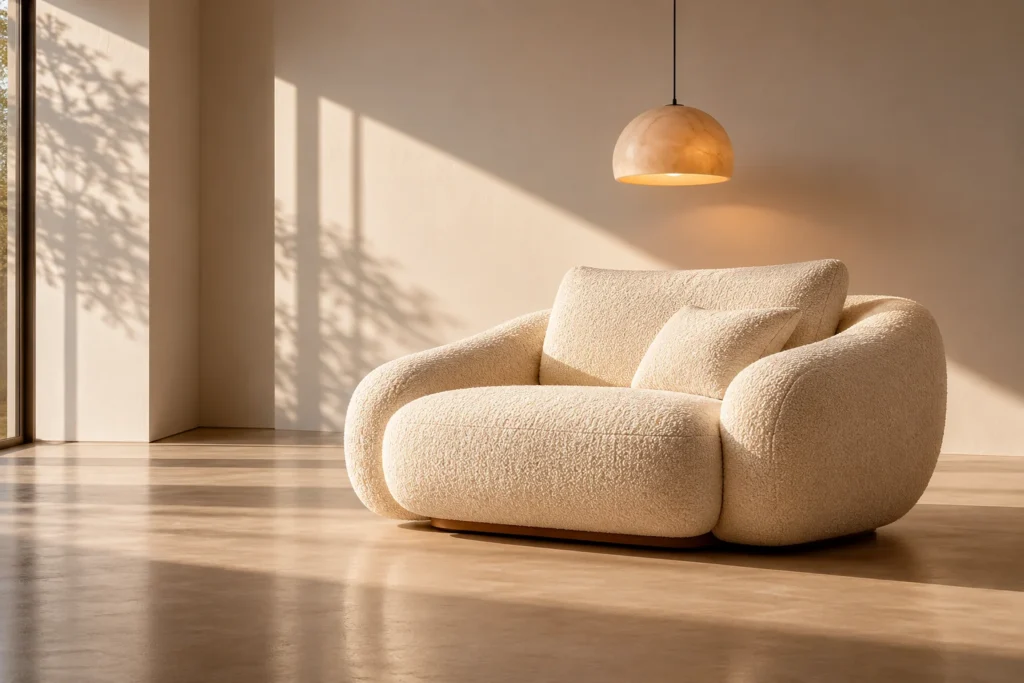
The best minimalist rooms in 2026 have ONE thing that makes you say ‘wow’ — and everything else is intentionally quiet to let that piece breathe.
In my living room, it’s a deep terracotta curved armchair. Literally nothing else competes with it. The rug is plain. The coffee table is glass (almost invisible). The walls are bare. And that armchair? People walk in and immediately comment on it.
Your statement piece could be a sculptural floor lamp, a single large-format painting, or an unusual coffee table. Whatever it is, let it be the boss of the room.
- Everything else should be neutral in color and simple in form
- Avoid adding a second ‘statement’ — that just creates competition
- The negative space around the piece IS part of the design
Idea #3: Invisible Tech Integration
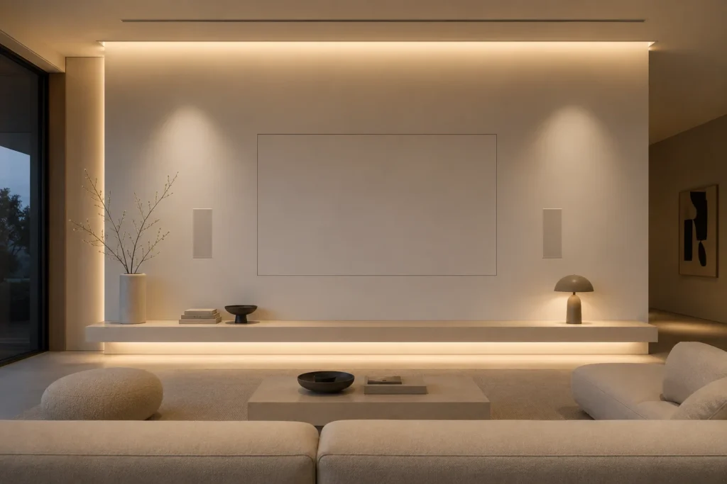
The single thing that ruined most living rooms in the 2010s? A giant black rectangle on the wall with cables draping down like vines.
In 2026, the tech-free aesthetic is huge — not because people stopped watching TV, but because they got smarter about hiding it. Here are approaches that actually work:
- Samsung Frame TV: When off, it displays art and literally looks like a framed painting on your wall
- Recessed flush mounts: TV sits inside the wall flush, no frame visible
- Panel walls: A full-height wooden slat panel where the TV is mounted — cables run invisibly behind
- Projector + retractable screen: No permanent screen at all. Pull it down when needed
I went the Samsung Frame route. Best $1,200 I ever spent on this project. The room feels completely different when the TV isn’t ‘on’.
Idea #4: Curved Furniture Minimalism
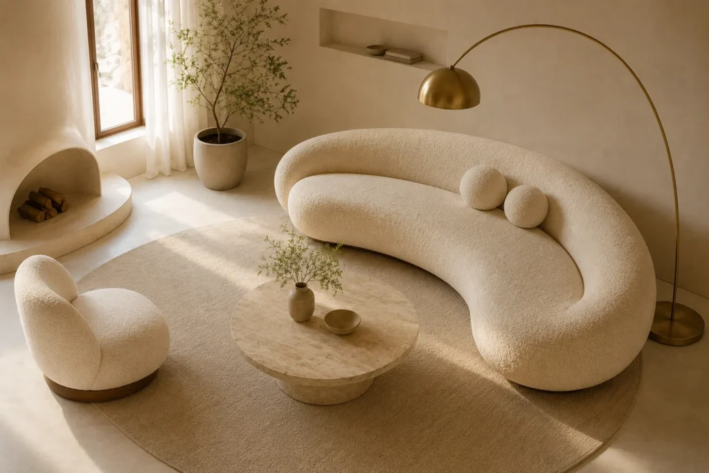
We’ve been living with sharp, boxy furniture for decades. In 2026, the shift to curves is dramatic — and honestly it makes minimalist rooms feel so much less clinical.
Curved sofas, round coffee tables, arched lamps — these organic shapes add visual warmth without adding visual weight. A curved sofa somehow looks less ‘heavy’ than a rectangular one even if it’s physically larger.
The key here is consistency: if you go curved, commit. A curved sofa with a square coffee table creates tension. A curved sofa with a round travertine coffee table and an arched lamp? Chef’s kiss.
- Boucle fabric is the go-to texture for curved pieces in 2026
- Travertine and marble work perfectly for round tables
- Arch floor lamps from brands like Ferm Living or H&M Home hit the look at different price points
Idea #5: Biophilic Minimalism — Nature as Decor
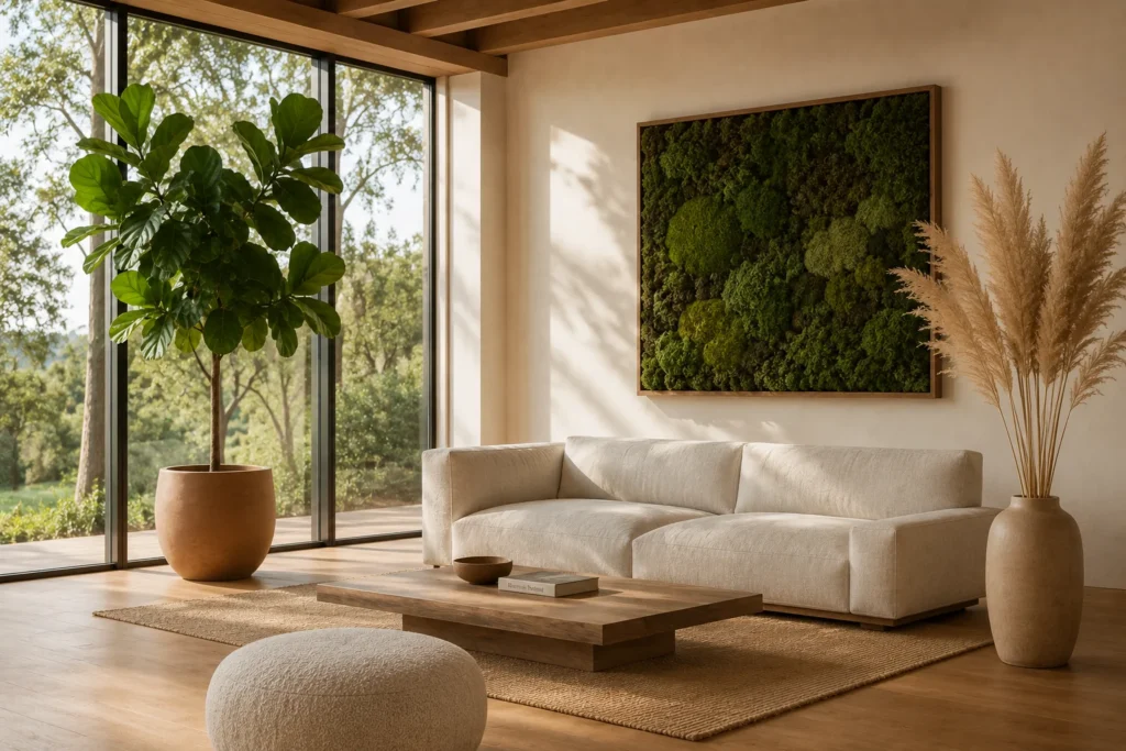
Here’s something I discovered after stripping my room down: empty walls are fine, but an empty room with zero nature feels weirdly sterile. One large plant fixed everything.
Biophilic design — connecting interior spaces to nature — is one of the biggest wellness-driven trends in 2026 interiors. But it works in minimalism only when done with restraint.
The rule I follow: one large statement plant instead of twelve small ones. A single fiddle-leaf fig or monstera makes a room feel alive. Twelve succulents in individual pots just looks busy.
- One oversized floor plant in a simple terracotta or cement pot
- Dried pampas grass or eucalyptus branches in a tall neutral vase
- A moss wall panel if you want green without maintenance
- Natural light amplification with mirrors to make plants thrive
Idea #6: Monochromatic Layering Done Right
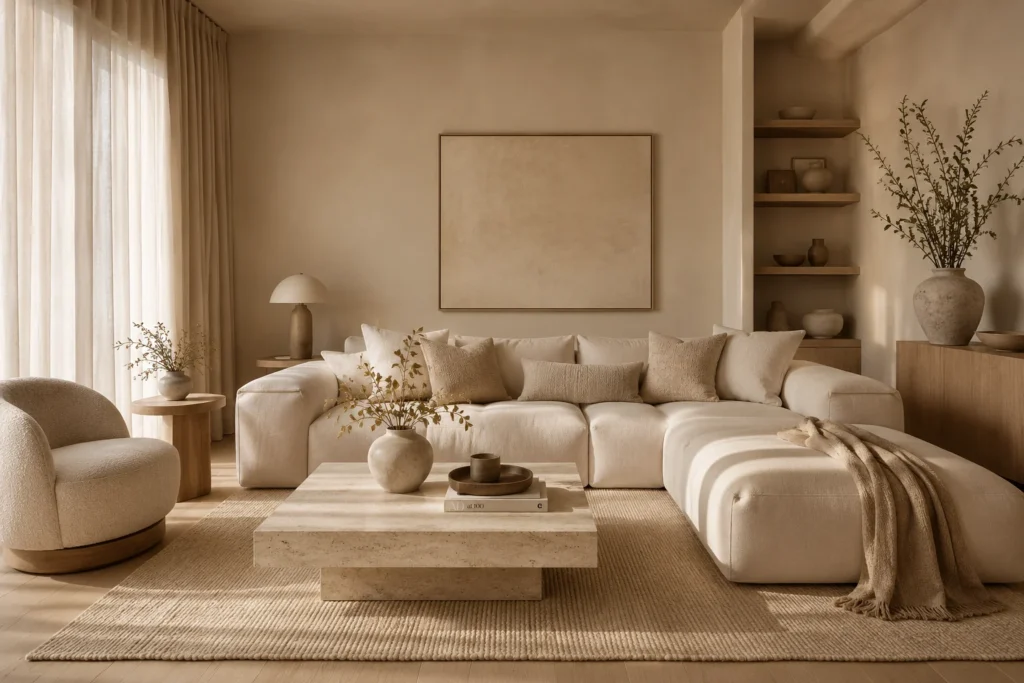
This was the biggest visual shift in my own space. I was afraid everything being the same color would look boring. Turns out, it looks incredibly sophisticated when done correctly.
Monochromatic doesn’t mean one flat shade — it means multiple tones and textures within the same color family. Imagine cream walls, a warm beige sofa, an ivory rug, oatmeal linen curtains. On paper it sounds monotonous. In person it feels like a high-end hotel suite.
The secret is texture variation: smooth walls against nubby linen against chunky knit against polished wood. Your eye travels the room based on texture rather than color, which feels calm instead of chaotic.
- Choose a base color: warm beige, clay, sage, or dusty rose
- Layer 4-5 shades within that family — light to slightly darker
- Vary textures aggressively: matte, shiny, woven, smooth, rough
Idea #7: The Floating Furniture Illusion
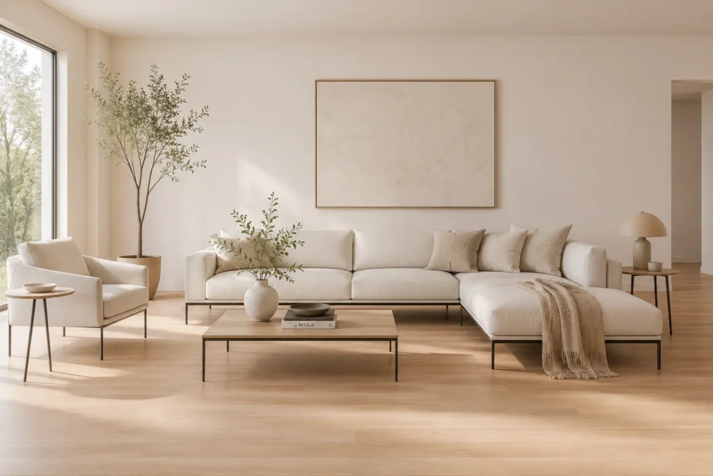
I have a small living room. Not apartment-small, but definitely not open-plan-small. The single trick that made it feel twice as large? Every piece of furniture now has visible legs.
Floor-to-furniture creates a visual ‘wall’ that chops a room in half. Legs on furniture let light travel underneath, which makes the floor feel continuous and the room feel open.
This applies to your sofa, coffee table, TV console, side tables, even bookshelves. Anything that sits flush on the floor blocks visual flow. Anything raised creates airiness.
- Aim for at least 5-6 inches of clearance under furniture
- Thin metal or tapered wood legs work best for minimalist aesthetic
- Floating wall shelves instead of floor-standing units continue the effect
- A light-colored or reflective floor amplifies the effect dramatically
Idea #8: Smart Minimalism — Where AI Meets Interior Design
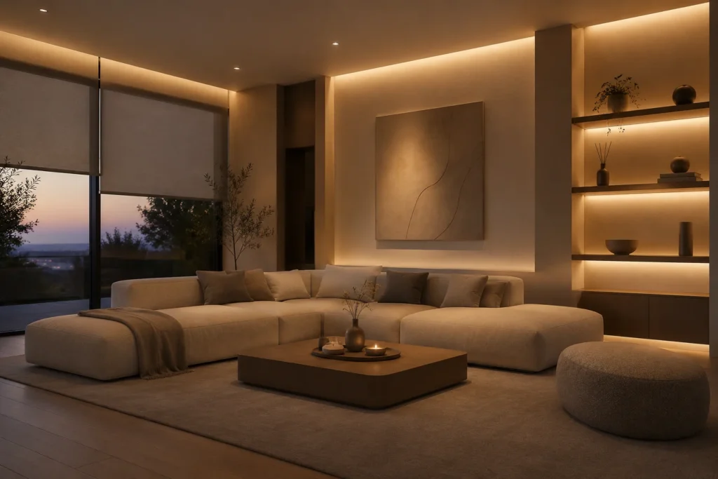
Here’s something nobody talks about in minimalism content: smart home tech, when done right, is actually one of the best minimalism tools available.
Automated blinds mean no cords to hide. Voice-controlled lights mean fewer switches and lamps. A single smart hub (now running Matter protocol which makes all devices play together) means your phone controls everything — no six different remotes on your coffee table.
I use Philips Hue for lighting, a Lutron Caseta for switches, and a single Google Nest hub hidden in a cabinet. My living room has no visible switches except one. Everything else is voice or phone controlled.
- Matter protocol: your Apple, Google, and Amazon devices finally work together in 2026
- Motorized blinds = no cord clutter, instant room mood change
- Smart diffusers replace multiple candles with one clean device
- Hide smart speakers inside shelves or cabinets — they hear you through walls just fine
Idea #9: Textural Contrast Without Visual Clutter
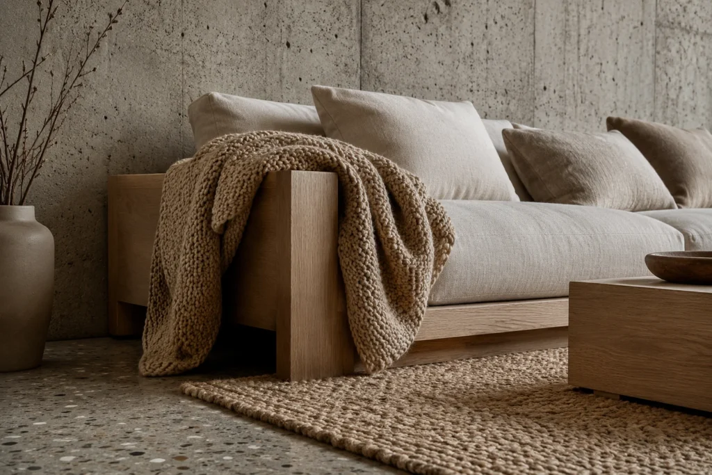
The complaint I hear most often about minimalism: ‘It looks cold and boring.’ That’s a texture problem, not a minimalism problem.
The most beautifully minimal rooms I’ve been in — and I’ve done a lot of Airbnb research in the name of ‘inspiration’ — all have wild textural contrast. A rough plaster wall next to a smooth linen sofa. A chunky knit throw on a polished wood surface. A shaggy rug on a matte concrete floor.
Your eyes get interest from texture even when colors are quiet. This is the secret to a room that feels ‘warm’ instead of ‘cold’ despite having very few objects in it.
- Aim for at least 3-4 different texture families in one room
- Contrast rough vs smooth, matte vs reflective, soft vs hard
- All in the same color family so it reads as cohesive, not chaotic
Idea #10: The Empty Corner — Why Nothing Is Everything
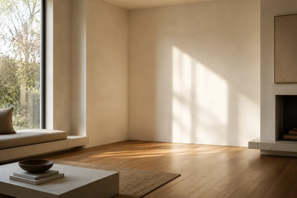
This one is the hardest for people to actually do. We’re wired to fill corners. Plant? Floor lamp? Stack of books? SOMETHING.
But here’s what I found after leaving one corner of my living room completely empty for a month: that corner became my favorite part of the room. Guests would notice it. ‘Is something going there?’ No. That IS the design.
In Japanese aesthetics, this concept is called ‘ma’ — the meaningful emptiness between things. The space itself carries weight. An empty corner makes the furnished parts of your room feel more intentional, not more sparse.
Try it for two weeks. Just try it. Put whatever was in that corner in storage. Give the space a chance.
Idea #11: Warm Brutalism — The Unexpected 2026 Trend
Okay, this one is niche — but it’s blowing up on design platforms right now and it’s genuinely stunning if you pull it off.
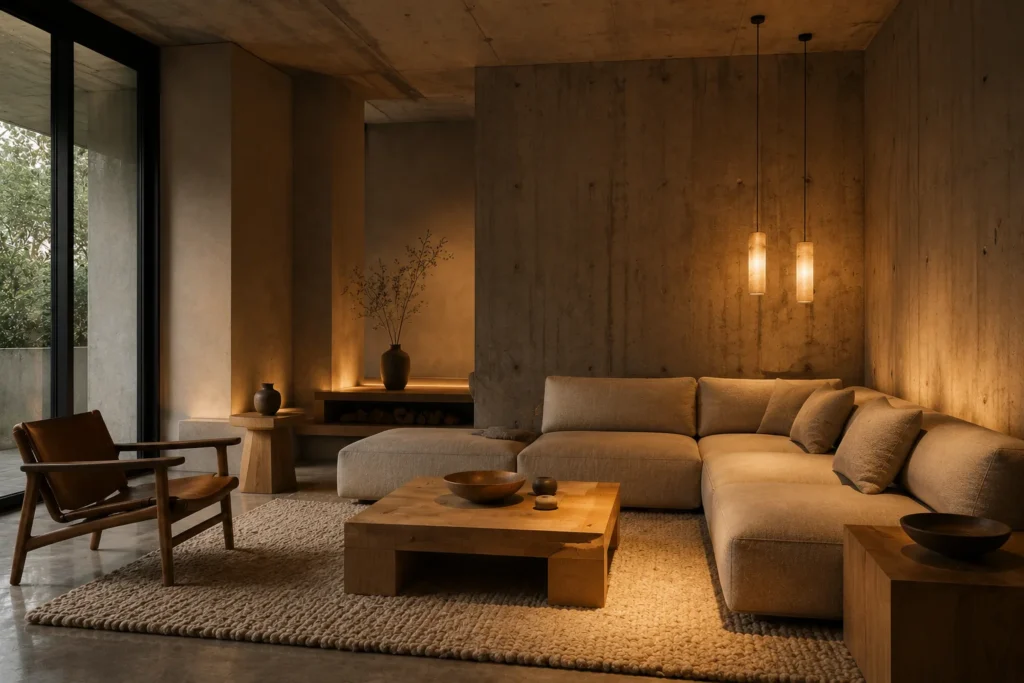
Warm brutalism takes the raw, unfinished aesthetic of brutalist architecture (exposed concrete, bare bones structure) and softens it with warm materials and lighting. The result feels expensive, intentional, and completely different from anything in the ‘beige minimalism’ lane.
You don’t need an exposed concrete apartment to do this. A single concrete-finish plaster wall, warm amber pendants, and simple solid-wood furniture creates the vibe. Keep everything else stripped back.
- Use microcement or concrete plaster on one accent wall only
- Warm tungsten or amber bulbs are non-negotiable — cool white kills the look
- Heavy wool or chunky rugs to soften the hard materials
- No art, no shelves — the wall material IS the art
Idea #12: Wabi-Sabi — Beautiful Imperfection
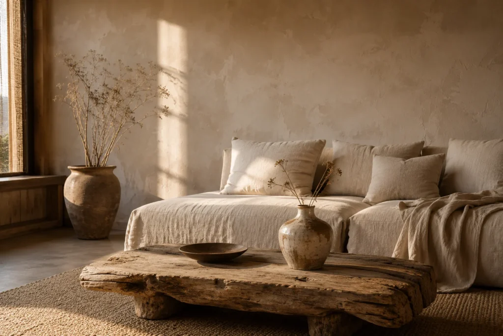
This Japanese concept translates roughly to ‘finding beauty in imperfection’, and it’s the complete antidote to the overly polished Instagram interiors of the past decade.
A wabi-sabi minimalist room in 2026 features handmade ceramics with irregular shapes, furniture with visible grain and natural variation, linen that wrinkles, walls with a subtle plaster texture. Nothing is perfectly smooth or machine-finished.
The beauty is in the honesty of materials. A hand-thrown ceramic bowl on a rough-hewn wood shelf, with a dried flower stem that’s slightly drooping — that’s not imperfection, that’s character.
- Source handmade ceramics from local makers or Etsy shops
- Natural plaster walls (limewash or venetian plaster) instead of flat paint
- Driftwood, reclaimed wood, or live-edge surfaces for tables
- Dried botanicals over fresh — more wabi-sabi, less maintenance
Idea #13: Floor-to-Ceiling Negative Space Architecture
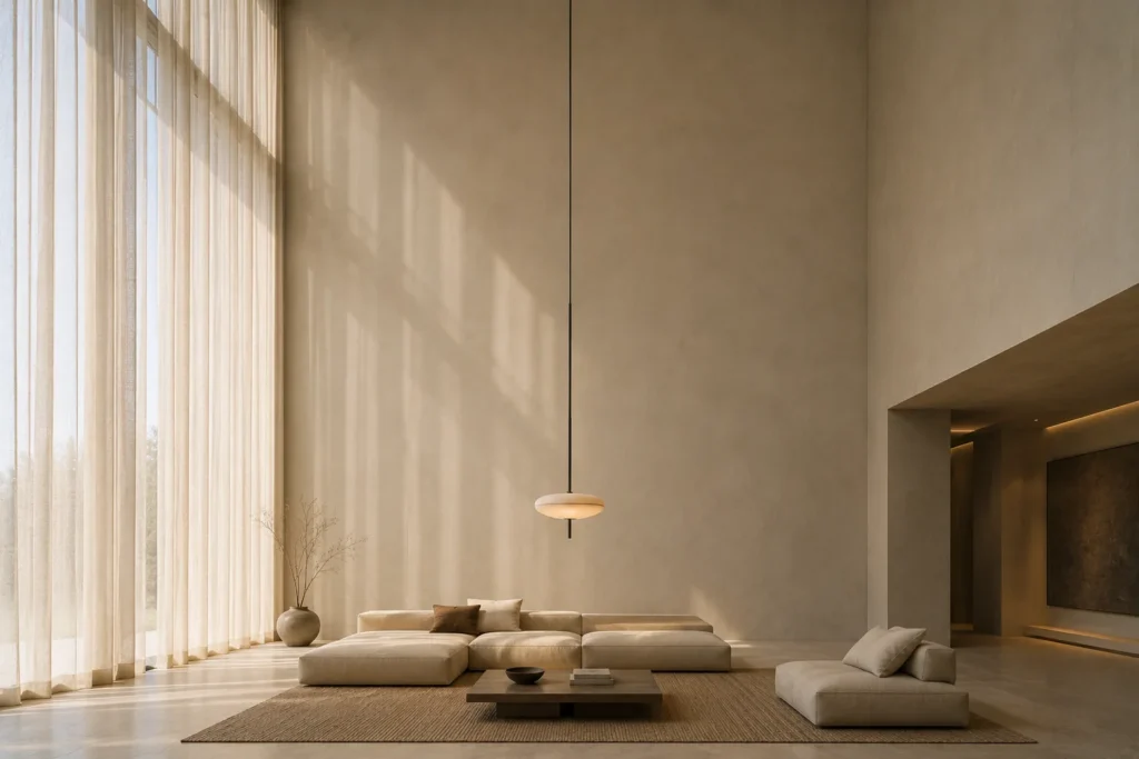
If you have high ceilings, I’m going to need you to stop filling that vertical space. I mean it.
High ceilings are one of the most coveted architectural features, and the worst thing you can do is break up that vertical negative space with shelves at five feet, artwork stacked up the wall, or pendant lights hung too low.
The correct move in 2026: keep furniture extremely low, hang ONE light that drops dramatically from the ceiling, and leave the upper portion of your walls completely bare. Let the room breathe vertically. It feels monumental even if the square footage is modest.
- Low-profile furniture (max 30-inch height) to exaggerate ceiling height
- Hang curtains at ceiling level, not window level — makes windows look enormous
- One dramatic pendant on a very long cord/chain
- Leave top 40% of walls absolutely bare — resist the urge
Idea #14: Modular Hidden Storage — The Real Secret to Minimalism
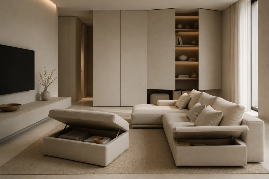
Here’s the unsexy truth about minimalist living rooms: someone with a clean, clutter-free room doesn’t have less stuff — they have better storage.
The minimalist living room 2026 trend is all about modular hidden storage. Ottomans with lift-tops. Sofas with built-in arm storage. TV consoles with push-to-open doors (no visible handles). Wall panels that open into full shelving systems.
My entire living room’s ‘stuff’ — chargers, remotes, blankets, books, games — lives in three hidden places. To anyone visiting, the room looks like nobody actually lives there. In reality, everything has a place that closes completely.
- Invest in an oversized storage ottoman as your main coffee table
- Look for ‘push-to-open’ hardware for any cabinets — no visible handles
- IKEA KALLAX inserts with solid doors are an affordable hidden storage hack
- Under-sofa storage baskets on wheels for seasonal items
Idea #15: Candlelit Minimalism — Lighting as the Final Layer
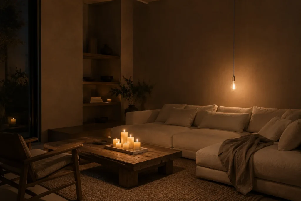
This is the last idea and honestly the most transformative one. You can do everything else on this list perfectly, and then flip on a harsh overhead light and ruin the entire mood.
Lighting is not decoration in a minimalist room — it IS the room. Evening lighting especially makes or breaks the whole aesthetic.
My setup: zero overhead ceiling lights after 6pm. Instead — two table lamps on dimmers, one arc floor lamp, candles on a concrete tray, and Philips Hue strips behind my TV console on the warmest amber setting. The room goes from functional to incredible without changing a single piece of furniture.
- Layer at minimum three light sources at different heights
- Always use warm white (2700K-3000K) — never cool white in living spaces
- Dimmers on every light — they cost $20 and change everything
- Candles: simple pillar or taper styles, nothing decorative-shaped
- Try the ‘no overhead lights for one week’ challenge — you’ll never go back
COMMON MISTAKES TO AVOID
Mistakes I Made So You Don’t Have To
I made almost every mistake possible before my minimalist living room came together. Here are the big ones:
Mistake 1: Buying Minimalist-Looking Stuff Instead of Getting Rid of Stuff
I spent months buying ‘minimal’ decor — geometric vases, simple frames, clean-lined furniture — while never actually removing things. The room just got more crowded with minimalist-looking objects. Minimalism is subtraction, not replacement.
Mistake 2: Going Too Cold
My first attempt: white walls, gray sofa, glass coffee table. It looked like a dentist’s waiting room. Minimalism in 2026 needs warmth — in materials, in light, in color. If your room feels clinical, add warmth before adding objects.
Mistake 3: Decluttering Without a Storage Plan
I donated half my stuff, then realized I actually needed some of it. Establish where things live before you edit them out. Hidden storage first, then declutter.
Mistake 4: Doing It All at Once
I pulled everything out of my living room in one weekend and then panicked. Minimalism works better in stages — one wall at a time, one furniture piece at a time.
Mistake 5: Ignoring Lighting
I treated lighting as an afterthought. It should be the first thing you plan. Everything else in your minimalist room depends on the quality of light hitting it.
7-DAY ACTION PLAN
How to Minimalize Your Living Room in 7 Days
You don’t need a renovation. You need a process. Here’s the exact one that worked for me:
Day 1: Audit Everything
Take your phone, walk around your living room, and photograph every single object. Every. Single. One. Then look at those photos like you’re a stranger seeing the room for the first time. It’s brutal but necessary.
Day 2: The ‘Keep-Store-Remove’ Sort
Three piles: things that stay (truly earn their place), things that go into storage for 30 days (if you don’t miss them, they leave for good), and things that leave immediately.
Day 3: Plan Hidden Storage
Before anything goes back into the room, figure out where the ‘stay’ items will actually live hidden. If there’s no hidden home for it, it either leaves or you buy a storage solution.
Day 4: Address Lighting
Swap any cool-white bulbs for warm white. Install a dimmer on at least one light. Move lamps to create layers. Spend the evening in the room with only low light on and observe.
Day 5: The Wall Edit
Take down 70% of your wall art. Live with mostly bare walls for two days. You’ll be surprised what the room tells you about what, if anything, should go back up.
Day 6: Furniture Audit
Is every furniture piece earning its place? Does the sofa work? Is that side table actually used? This is the day to make the hard calls. Even if it’s temporarily uncomfortable, remove the pieces that don’t contribute.
Day 7: Add Back With Intention
Now — and only now — add back what you want. One plant. One piece of art. One throw blanket. Add slowly, step back, live with each addition for a day before adding the next.
REAL TOOLS & APPS
Tools and Apps That Actually Helped Me
- Roomstyler 3D Planner (free) — I planned every furniture arrangement here before moving a single heavy piece
- Pinterest Trends 2026 Report — actual data on what styles are trending, not just what’s popular on feeds
- Houzz (app) — best photo filtering for minimalist 2026 specific rooms, use ‘style’ filter
- Apartment Therapy’s Small/Cool archive — real people, real small spaces, incredibly practical inspiration
- IKEA’s online room planner — unglamorous but genuinely useful for planning storage furniture placement
- Philips Hue app — lets you save ‘scenes’ for different times of day. My ‘evening’ scene does the heavy lifting
- Dezeen.com — for high-end minimalism inspiration when you need to see what’s actually possible
FINAL THOUGHTS
It’s About How the Room Makes You Feel
Here’s the thing I didn’t expect from my minimalist living room 2026 project: the biggest benefit wasn’t visual. It was mental.
Walking into a room where everything has been chosen deliberately, where there’s space to breathe, where nothing is demanding your visual attention — it genuinely reduces stress. I started actually enjoying my living room instead of just passing through it.
The 15 ideas in this article aren’t rules. They’re starting points. Your minimalist living room might be japandi with smart tech, or warm brutalist with biophilic touches, or pure monochromatic with nothing but one incredible chair.
Start with less. Then add back only what earns its place.
That’s the whole thing. The rest is just furniture.
If you want to go deeper, check out Apartment Therapy’s minimalism guides, or browse Dezeen’s 2026 interior roundups for professional-level inspiration. And if you’ve got a small apartment specifically, internal guides on small-space storage hacks and japandi furniture picks will help you apply these ideas to tighter layouts.
You May Also Like These Posts
→ Budget Kitchen Makeover 2026
→ 4th of July Front Porch Decor Ideas
→ Summer Home Décor Ideas 2026